Visualizing Tagalog NER embeddings
I found this nice blog post that demonstrates how we can glean insights just from visualizing ConLL NER embeddings. They ran DistilBERT on the span labels to get their embeddings, and then projected them to 2D space using t-SNE. I think this approach has a lot of potential applications, from quality assurance to performance prediction.
For now, I am just curious as to how they would look like in our Tagalog NER dataset. My approach is similar to the blog post I mentioned. Only difference is that I’m using a trained RoBERTa Tagalog model to get the embeddings. Finally, there’s nothing new about these methods: dataset cartography has already been an active area of NLP research ever since (Swayamdipta et al., 2020; Balasubramanian et al., 2020).
You can find the code and implementation here.
Examining clusters for all labels
Below you’ll find the t-SNE plot for all entities in our dataset. They are color-coded based on their type— Person (PER), Organization (ORG), and Location (LOC). When you hover over each point, you’ll see the span text, its label, and a portion of the sentence it belongs to. Feel free to explore around using the visualization tools from Plotly.
Figure: t-SNE plot for all entity labels in TLUnified-NER.
LOC and ORG superclusters
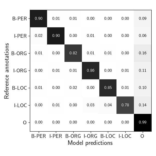
At first glance, we see that PER entities are clearly separated from ORG and LOC, whereas the other two have noticeable overlaps. My hunch here is that even if two entities have the same lexical properties, they have different semantic use. For example, Malacañang (the place where the Philippine President resides, akin to The White House) can either be an organization or location based on its usage. We can verify this observation by examining the confusion matrix of a simple transition-based NER model: it significantly misconstrues LOC entities as ORG (and vice-versa).
| Embeddings set-up | ORG | LOC |
|---|---|---|
| Shared | \(+5\%\) | \(+3\%\) |
| Context-sensitive | \(+12\%\) | \(+18\%\) |
To further test this “lexical-semantic confusion” hypothesis, I trained two additional models that account for a word’s position in the text. The first model uses spaCy’s shared token-to-vector layer that includes a dependency parser and POS tagger aside from NER. The hope is that by sharing information between these three components, our downstream NER model can learn how to disambiguate between these semantic differences. The second model uses a transformer network to obtain context-sensitive vectors. It is interesting then that the relative error for LOC ↔ ORG decreased when using these methods. Therefore, I highly-recommend using context-sensitive techniques when training models from this dataset.
Interesting observations from other clusters
I also want to share interesting clusters from examining all labels. I’m literally just spitballing here: there’s nothing methodical aside from inspecting a few clusters and checking their neighbors. With that in mind, take these observations with a grain of salt.

Political clusters are intriguing. There are some interesting neighborhoods that intrigued me. For example, the Nograles cluster is isolated from most PER entities. Its closest PER cluster is Arroyo, and the majority of its neighboring clusters include Mindanao, MILF, and some cities near Davao. My hunch is that most news stories in the corpus were written during a time when Prospero Nograles’s involvement in Davao and the Arroyo administration is apparent (he was the Speaker of the House).

Now, we’re entering speculative territory but it’s cool that you can at least draw political lines during the 2004-2010 administration. Of course, it’s hard to draw these lines because unlike the US, the Philippines has a multi-party system. It’s fun to point out but I admit that what I’ve been doing is just akin to a Rorschach test. If you’re looking for something more rigorous, I suggest reading the work of Rheault et al (2019). This led me to ask: can we predict shifts in political alliances from words alone? I think it is an interesting exercise— and especially challenging— given that political parties in the Philippines are not really defined by their ideologies.

Biases exist. I also noticed clusters that might potentially be sources of bias when training models from this dataset. For example, most news sources from Mindanao involve acts of terrorism from Abu Sayyaf and the Moro National Liberation Front. It is then unfortunate that entities such as Allah and Muslim are co-located within this neighborhood.
Personally, I’m interested to explore techniques to debias corpora from an embeddings standpoint. The works of Prost et al. (2019) and Kaneko et al. (2021) for gender bias come to mind.
Examining clusters for each entity type
Here, I plotted the embeddings for each entity type while categorizing them based on their span property: paren (if the span is preceded by a parenthesis), all_caps (if all characters in the span are in uppercase), initial (if the span is the first subword in the text), and plain as a catch-all category.
These classes are mutually exclusive, i.e., I automatically assign them based on the first property they fulfill.
PER embeddings
Most PER entities were categorized as plain, and it is mostly expected. Although I find it interesting that there is a sizeable amount of names made up of initials such as FVR for Fidel V. Ramos or GMA for Gloria Macapagal Arroyo. Most of our benchmarks had little to no problem recognizing PER entities and my hunch is likely due to the straightforward and consistent structure of such entities.
The prevalence of initials in naming individuals usually stem from cultural influences in the Philippines. It is customary to use initials to refer to prominent figures, such as Presidents and CEOs. I have only scratched the surface on these entities, so feel free to explore around the interactive plot!

LOC embeddings
It is cool that if you squint hard enough, you can see cities in the Philippines arranged in their geographical location—based on their embeddings alone. Of course, there are still inconsistencies: Manila is located at the rightmost portion whereas Bulacan appears in the middle. Why would that be the case? My hunch is that in-country linguistic diversity is still apparent, and somewhat recoverable, through these embeddings. For example, Mindanao is predominantly Muslim, hence affecting naming and proper noun patterns (you’ll often see instances of Muhammad or Al- in Mindanaoan names). These variations borne out of geographical differences may correlate with the linguistic clusters we now see.
My other theory is politics. Although there is a central government, regional politics still dominate. Politicians tend to co-occur with one another in news reports, especially if they belong to the same region. Perhaps these co-occurences caused some of the “geographical separation” we see in our embeddings. Might be fun to explore in the future!
ORG embeddings
It’s nice that most government departments are members of the same cluster.
This can lead to improved accuracy in NER tasks, as a model can easily recognize and categorize these entities.
Hopefully, this can be a good visual cue that the embeddings have captured the underlying relationships between different organizations.
They are similar to PER entities, with the exception that they have a more recognizable orthographic “shape.”
For example, most organizations in news reports are acronyms.
And so, writers tend to give its full name first, then followed by its shorthand (e.g, XXXXX XXXXX XXX (XXX)).
Final thoughts
Visualizing embeddings is a nice exercise of “examining your data.” Although I have to admit that I have made some huge leaps of logic while explaining my observations above— I’m still getting better at this! In the future, I’m more interested in how these techniques can be applied, and how we can test them via a more empirical approach. For example, we can get LLM embeddings, cluster them together, and examine the outliers. There might be cool applications for correcting annotations or annotating a dataset from scratch. For now, I think this is fun!
References
- Swabha Swayamdipta, Roy Schwartz, Nicholas Lourie, Yizhong Wang, Hannaneh Hajishirzi, Noah A. Smith, and Yejin Choi. 2020. Dataset Cartography: Mapping and Diagnosing Datasets with Training Dynamics. In Proceedings of the 2020 Conference on Empirical Methods in Natural Language Processing (EMNLP), pages 9275–9293, Online. Association for Computational Linguistics.
- Sriram Balasubramanian, Naman Jain, Gaurav Jindal, Abhijeet Awasthi, and Sunita Sarawagi. 2020. What’s in a Name? Are BERT Named Entity Representations just as Good for any other Name?. In Proceedings of the 5th Workshop on Representation Learning for NLP, pages 205–214, Online. Association for Computational Linguistics.
- Ludovic Rheault and Christopher Cochrane. 2020. Word Embeddings for the Analysis of Ideological Placement in Parliamentary Corpora. Political Analysis, 28(1), 112-133. doi:10.1017/pan.2019.26.
- Flavien Prost, Nithum Thain, and Tolga Bolukbasi. 2019. Debiasing Embeddings for Reduced Gender Bias in Text Classification. In Proceedings of the First Workshop on Gender Bias in Natural Language Processing, pages 69–75, Florence, Italy. Association for Computational Linguistics.
- Masahiro Kaneko and Danushka Bollegala. 2021. Debiasing Pre-trained Contextualised Embeddings. In Proceedings of the 16th Conference of the European Chapter of the Association for Computational Linguistics: Main Volume, pages 1256–1266, Online. Association for Computational Linguistics.