
MRT-3 Passenger Traffic Visualization
As a regular MRT-3 passenger, the idea of congestion is strongly familiar. In fact, the ebb and flow of passengers give rise to some familiar patterns that we observe in our everyday commute. We notice peak hours, highly-congested stations, and overall traffic. In this notebook, I will explore these patterns in our MRT-3 system through data. The data was sourced from the open data website of the Department of Transportation and Communication (DOTC). This short analysis is divided into three parts:
Peak hours of the day
Below we can see how many passengers, on average, move in and out of the MRT system throughout the day.
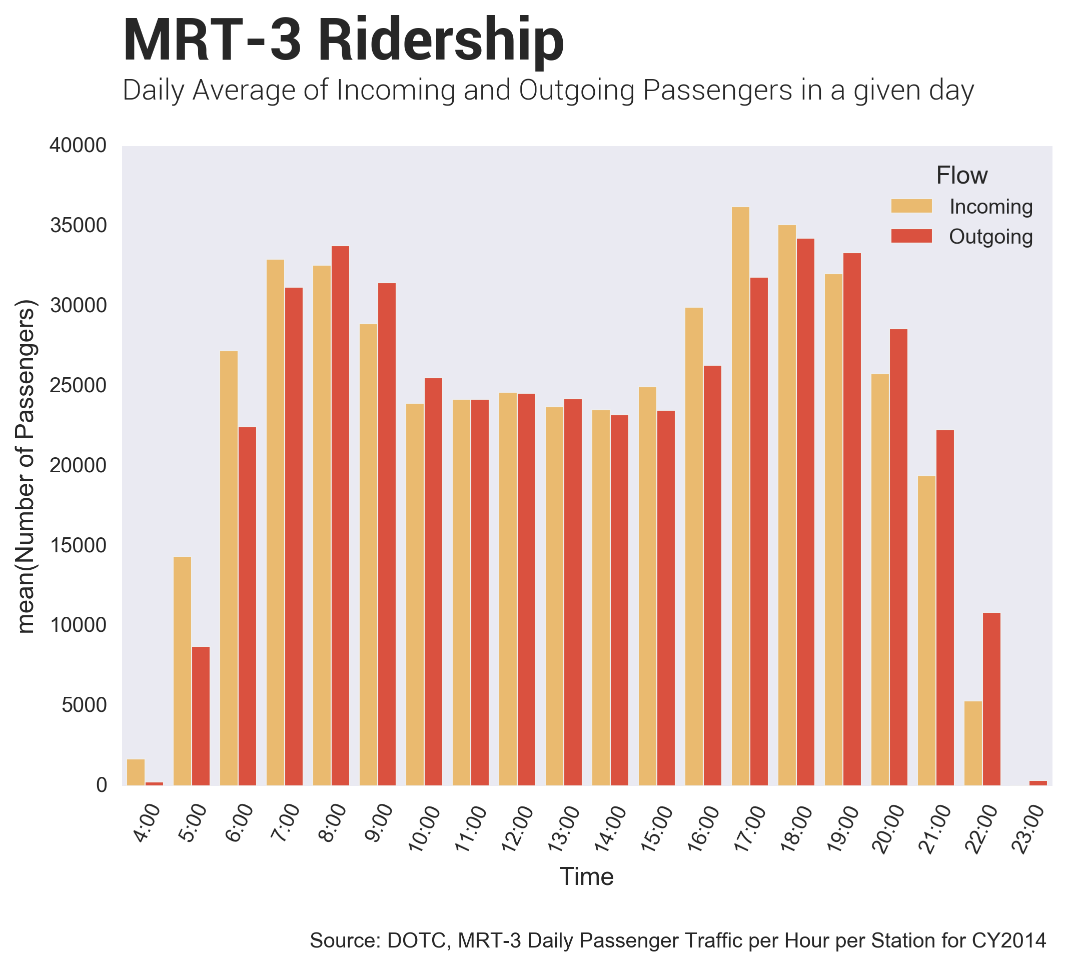
Peak hours in the MRT range from 6:00 to 9:00 in the morning and 4:00 to 7:00 pm in the afternoon. These peak hours correspond to the time when people go to work in the morning and go back home in the afternoon. We can then observe how large the difference is, in terms of the number of passengers, in between the two peak hours.
Although it can easily be advised to avoid the rush hour, not all employees are privileged to do that. Riding the MRT-3 by 5:00 AM is a huge sacrifice (imagine going up very early in the morning for your 8:00 AM work!), and leaving work before 5:00 PM is impossible. Some people find a hack by delaying their travel time by staying at the office until the evening; in which we can see, that the frequency of passengers diminishes through the night.
Passenger Traffic throughout the day
Next, I would like to see how congestion differs for each station throughout the day. In this case, I created a heatmap, where intense colors represent higher congestion. All the MRT-3 stations are at the y-axis, and the hour of the day at the x-axis.
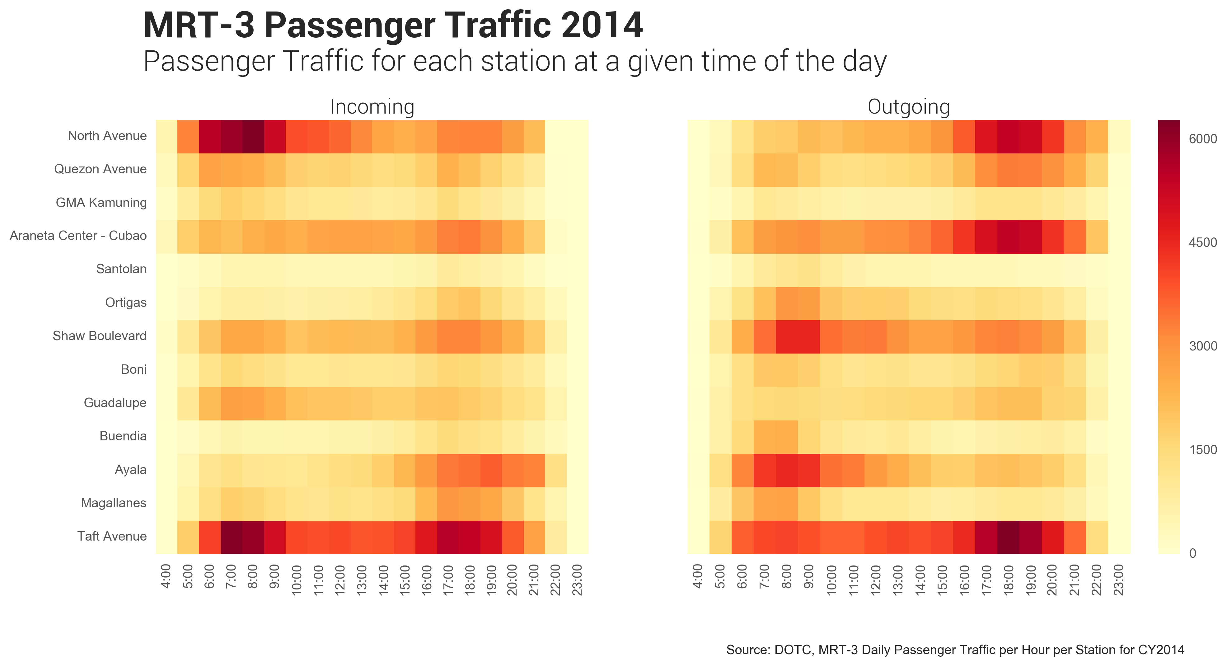
Looking at the heatmap on the left, we can see the stations where most people enter: North Avenue Station and Taft. We can also see in the same map that Taft Station always has a constant influx of passengers throughout the day. In addition, the North Avenue congestion can be attributed to the fact that most employees go to work in places like Makati and Ayala, thus congesting the Southbound trip. It may take a lot of urban planning, but it is important that the congestion in the first station is distributed evenly among the other stations. This may entail the addition of jobs and offices that can be located near these points.
As we progress through the day, we can see the peak points (or areas of stronger intensity) developing along Araneta, Shaw, and Ayala. Intuitively, these places are all near Commercial Business Districts (CBD), and we see an influx of people entering these stations around our peak hours.
In our right-hand heatmap, we can then see the frequency of passengers that alight the MRT. In the morning, we see most of them exiting through Shaw (and some in Ortigas), Ayala, and Taft. In the afternoon/evening, most of the people alight the MRT in Araneta, Taft, and North Avenue. This is then consistent to the idea that most employees from the North go Southbound to work in places like Makati. In fact, if we look in our same heatmap, we can observe (in the morning) the places where people go, and the places where people go home to (in the evening).
Passenger Flux
I am then interested on how passenger flow changes througout the day. Below is an animated chart showing areas of higher passenger frequency (more intense colors) with respect to the stations throughout the day.
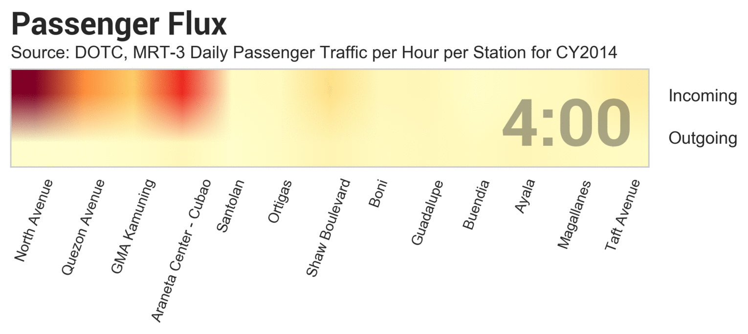
In the morning, we see that the influx of passengers often originate in the north, specifically in North Avenue, Quezon Avenue, and GMA Kamuning. Over time, we can then see how the congestion in the stations build-up, as more people are going in from different points of the MRT. We can also observe the stations where most passengers alight, and it is consistent to our observations from the heatmaps above.
In addition, as we progress through the night, we can see that the outflow of passengers develop in Araneta, and more so in North Avenue. It is then evident that the passenger flux in the morning go Southbound, while in the afternoon they go Northbound.
Conclusion
It is interesting how data can help us see patterns especially in a transportation system like the MRT. From data, we can determine usage patterns and see how they develop throughout the day. I hope that in the future, more fine-grained data will be collected for the MRT-3 (and perhaps for our other train lines as well). As of now, the data we have is coarse, and seems to generalize a lot. It may be interesting to see usage patters in the weekend, and the exact origin-destination of passengers that take the MRT-3