A lexical view of contrast pairs in preference datasets
Preference data is a staple in the final step of the LLM training pipeline. During RLHF, we train a reward model by showing pairs of chosen and rejected model outputs so that it can teach a policy model how to generate more preferable responses. The hope is, our reward model can capture the nuance and diversity of human judgment.
However, preference is subjective by nature, and few studies have tried articulating it. For example, some looked into different aspects of a response’s helpfulness / harmlessness (Bai et al., 2022) while others investigated surface-level characteristics like its length (Singhal et al., 2023).
In this blog post, I want to offer a different approach: what if instead of looking at qualitative aspects or token-level features, we use sentence embeddings? Sentence embeddings capture a text’s lexical and semantic meaning in a high-dimensional vector space. If so, can we ascertain lexical differences between chosen and rejected responses just by looking at text embeddings?
One reason why this is important is due to synthetic data. I think that it is easier to generate synthetic pairs conditioned on lexical distance (as opposed to some quality-based metric). Maybe, there are some tasks and domains where generating with respect to cosine distances is plausible.
Getting preference data
First, I sampled preference data across different sources. For bigger datasets such as SHP, I only took a particular subset I am interested in. The table below shows the sources I used:
| Dataset | Description |
|---|---|
| OpenAI’s Summarize from Human Feedback (Stiennon et al., 2022) | Dataset used to train a summarization reward model. I used the comparisons subset where each instance represents a matchup between two summaries. |
| Stanford Human Preferences Dataset (Ethayarajh et al., 2022) | Contains a collection of human preferences over responses to questions or instructions. I used the explainlikeimfive_train subset to represent OpenQA questions. |
| Argilla’s Ultrafeedback Multi-Binarized Cleaned Dataset | A clean version of the original Ultrafeedback dataset (Cui et al., 2023). The cleanup process can be found in their writeup. |
| Tatsumoto Lab’s Alpaca Farm (Dubois et al., 2023) | The human preference subset of the Alpaca Farm dataset. The researchers used this subset to compare their LLM judge’s preferences. |
| Berkeley Nest Lab’s Nectar Dataset | Preference ranking dataset for training the Starling 7B reward model (Zhu et al., 2023), and consequently, the Starling 7B language model. |
For OpenAI’s Summarize and SHP, the preferences are in the form of individual matchups. To get the canonical chosen and rejected responses, I used the Elo rating system to obtain the top and bottom completions.
Measuring distance between pairs
Given a set of preference data, I split the completions based on whether they were chosen (\(\mathbf{y}_w\)) or rejected (\(\mathbf{y}_l\)) by an evaluator—human or GPT, depending on the dataset. Then, I embedded them using sentence-transformers/all-MiniLM-L6-v2 to produce 384-dimensional sentence embeddings. Finally, for each row, I computed the distance (\(\mathbf{d}\)) between the chosen and rejected vectors. The figure below illustrates this process.
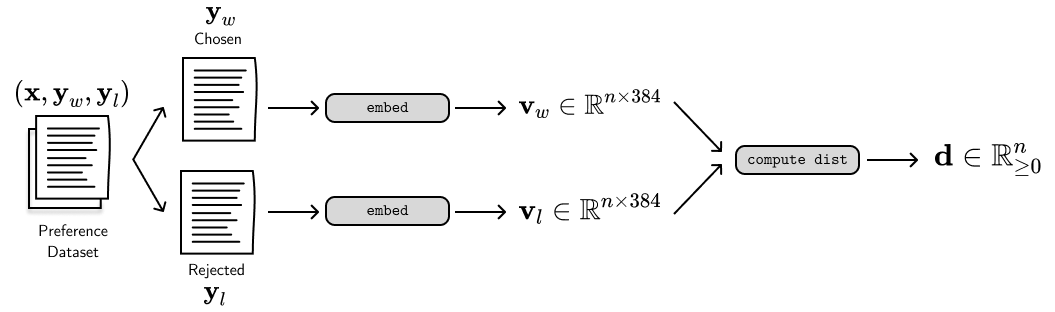
To compute the distances, I used the cosine distance from scipy.
Cosine distance measures the direction between two vectors, allowing us to capture similarity even if the length of the sentences or overall frequency of the words differ.
It is represented by the following equation:
where the distance value ranges from \((0, 2)\). Usually, when we talk about distances between preference pairs, we talk about quality-based distances. They’re often in the form of rankings (i.e., get top-1 and top-N) based on an evaluator’s assessment. Again, in this blog post we’re looking at lexical-based distances that are readily available from a text’s surface form. In the next section, I’ll discuss some interesting findings from these distance calculations.
Findings
Most of the charts I’ll be showing below are histograms. Here, the x-axis represents the cosine distance whereas the y-axis represents the probability density. We compute the probability density by normalizing the fraction of samples in each bin so that the sum of all bar areas equals 1. The best way to think about these value is in terms of chance, that is, how likely is a random preference pair have a distance \(\mathbf{d}\) on the x-axis?
Lexical differences are apparent in some datasets
The chart below shows the distribution across multiple preference datasets. AlpacaFarm and Nectar lie on both extremes. AlpacaFarm is particularly interesting because its completions were generated by API-based LLMs using prompts that replicate human variability and agreement. I’m unfamiliar with how exactly they prompted the LLM, but does that mean their process resulted in similar-looking texts?
On the other hand, Nectar’s completions were a combination of LLM outputs (GPT-4, GPT-3.5-turbo, GPT-3.5-turbo-instruct, LLaMa-2-7B-chat, and Mistral-7B-Instruct) alongside other existing datasets. Because Nectar formats its preferences in terms of ranking, the chosen and rejected pairs here represent the top and bottom choices.
Other datasets have distributions that I expected. For example, OpenAI’s summarization dataset should still have closer preference pairs because of the task’s inherent nature. Summarization is about compressing a text while maintaining information. Upon checking the actual preferences and corresponding evaluator notes, I noticed that rejected completions are oftentimes a matter of recall.
Elo ranking correlates with cosine distance
Next, I looked into how Elo ranking corresponds to the cosine distance of the text embeddings. Preference datasets like OpenAI’s Summarization, SHP, and Berkeley-Nest’s Nectar represent their preferences as individual matchups, allowing us to compute the Elo rating of individual completions. Then, we can order these ratings to achieve a rank of completions from most preferable to least.
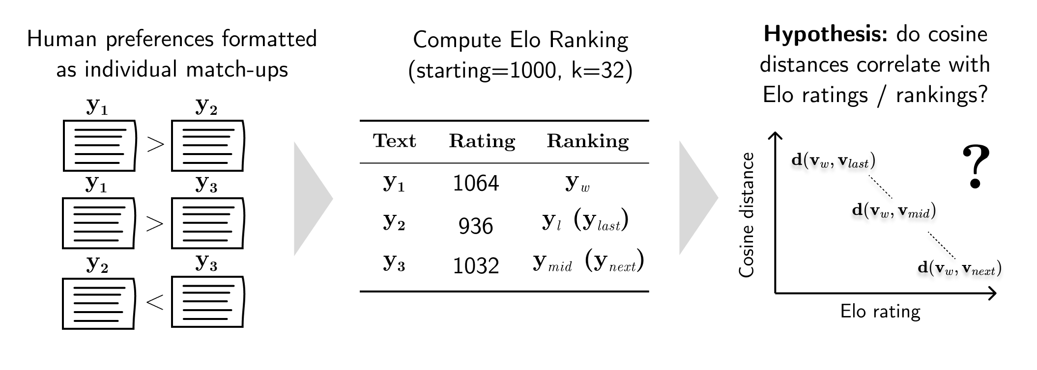
However, OpenAI’s Summarization and SHP have unequal number of ranks per prompt \(\mathbf{x}\). So to simplify the visualizations, I took the chosen completion \(\mathbf{y}_w\), the top-2 completion \(\mathbf{y}_{l,next}\), the middle-performer \(\mathbf{y}_{l,mid}\), and the bottom-performer \(\mathbf{y}_{l,last}\) (which is equivalent to \(\mathbf{y}_l\) in the previous section). On the other hand, Berkeley-Nest’s Nectar provides a 7-rank scale of preferences. This allowed me to compute the distance from the first and second choices until the last one: \(\mathbf{d}(\mathbf{y}_1, \mathbf{y}_{2\ldots7})\). Then, I plotted these distances in a histogram (I only retained the curve so that the charts look cleaner) as seen below:
The cosine distances from the OpenAI Summarization preference dataset follow a certain pattern: completions that are closer in ranking have smaller lexical distance. The average mid ranking is 2.042 (with a 4.109 average number of ranks) and the Pearson correlation between the distances and Elo ranking is 0.779.
For the Stanford Human Preferences (SHP) dataset, I chose the explainlikeimfive subset to simulate OpenQA tasks.
Interestingly, it has a less pronounced visual correlation even though its Pearson-r is 0.785, much higher than OpenAI Summarization.
The average mid ranking is 1.967 with an average rank number of 4.600.
For Berkeley-Nest’s Nectar dataset, the rankings were already given so I didn’t have to compute my own. Here, the Pearson correlation is 0.818. If you look at the “chosen and rejected (2)” red line, you’ll notice that the cosine distances start very small but fall off afterwards. It is interesting that completions that performed similarly during matchups are quite similar to one another based on their embeddings.
| Dataset | Number of ranks (avg) | Mid rank | Pearson-r Elo ranking | Pearson-r Elo rating |
|---|---|---|---|---|
| openai/summarize_from_feedback | 4.109 | 2.042 | 0.779 | -0.534 |
| stanfordnlp/SHP | 4.600 | 1.967 | 0.7845 | -0.458 |
| berkeley-nest/Nectar | 7.000 | 4.000 | 0.818 | - |
The table above shows the ranking statistics for each dataset. I also measured the Pearson correlation between the rejected text’s ranking (and Elo rating) with respect to its embedding distance from the chosen text. The sign (+/-) corresponds to the direction of the correlation. For example, the negative sign in the last column shows that as the text’s Elo rating increases, then its lexical distance from the chosen text decreases (i.e., they become more similar).
Lexical distance is consistent across preference attributes
Finally, I was curious how individual attributes of preference manifest in lexical distances using the HelpSteer dataset (Wang et al., 2023). Most datasets only give us a single view of human judgment, but HelpSteer provides finegrained preferences such as helpfulness, correctness, coherence, complexity, and verbosity.
So, I did the same experiments for each of these attributes and found that the distribution didn’t change much. I’m not quite confident on how I preprocessed this dataset. Unlike other preference datasets that uses matchups, HelpSteer uses scores from 0 to 4 so some texts can end up having the same scores. Here, I simply sorted the texts with their score, and designated the chosen text as the first one on the list (whatever Python’s sort function made it to be), and the rejected text as the last element. You can see the figure below:
I think that there’s still a lot that can be done on this angle. One way is to format the data in terms of individual matchups. This process leads to a forced ranking, allowing us to easily designate the chosen and rejected pair. Since HelpSteer is the only one we have (as far as I know), then I’ll leave my analysis as is for now.
Final thoughts
In this blog post, I presented a lexical view of preference pairs using embeddings. Using different preference datasets, I computed for their sentence embeddings, and then measured the cosine distance between chosen and rejected pairs. I found that some datasets exhibit lexical differences and that it correlates to human judgment (i.e., Elo rating). Finally, using the HelpSteer dataset, I saw that cosine distances are consistent even on different attributes of preference.
This experiment is really just a curiosity as I work on RLHF. I’ve been doing some experiments on my job that are a little bit orthogonal to this work. I think this is just my way of exploring interesting avenues and scratching my itch. If you’re interested in this type of work, feel free to reach out and discuss!
You can find the source code for this work on GitHub!